Red Cross visual identity guidelines
On this page, you will find guidelines and definitions for the visual identity of the Finnish Red Cross.
The Communications Services unit in the central office is responsible for the Finnish Red Cross’s visual identity. If necessary, please contact aineistot@redcross.fi.
Basic elements
A red cross on a white background is an international symbol that provides protection for medical services and Red Cross relief workers in armed conflicts. States own this international emblem, which doubles as the symbol for the medical services of the armed forces of these countries. The use of the emblem is closely regulated even in peacetime, and misuse of the emblem constitutes a crime.
The red cross and red crescent are also organisation symbols of the International Red Cross and Red Crescent Movement and its National Societies. This is why the Finnish Red Cross can use the emblem in its activities, with certain restrictions.
There are a select few instances in which the red cross is used alone, without any additional specification. Read more about the use of the red cross, red crescent and red crystal emblems here
In any unclear cases, or if you see the emblem being used incorrectly, please contact info@redcross.fi.

The national logo of the Finnish Red Cross consists of an emblem (cross) and logotype (text). The logo is always used on a white background. The logo files are available in the Material Bank.

The local districts and branches of the Finnish Red Cross use their own logos in connection with their activities. You can find the different versions of the logos in the Material Bank [link: materiaalipankki.punainenristi.fi].
Separate guidelines on the use of the logos are available for businesses working in cooperation with the Finnish Red Cross. You can request the guidelines from aineistot@redcross.fi
Protection area
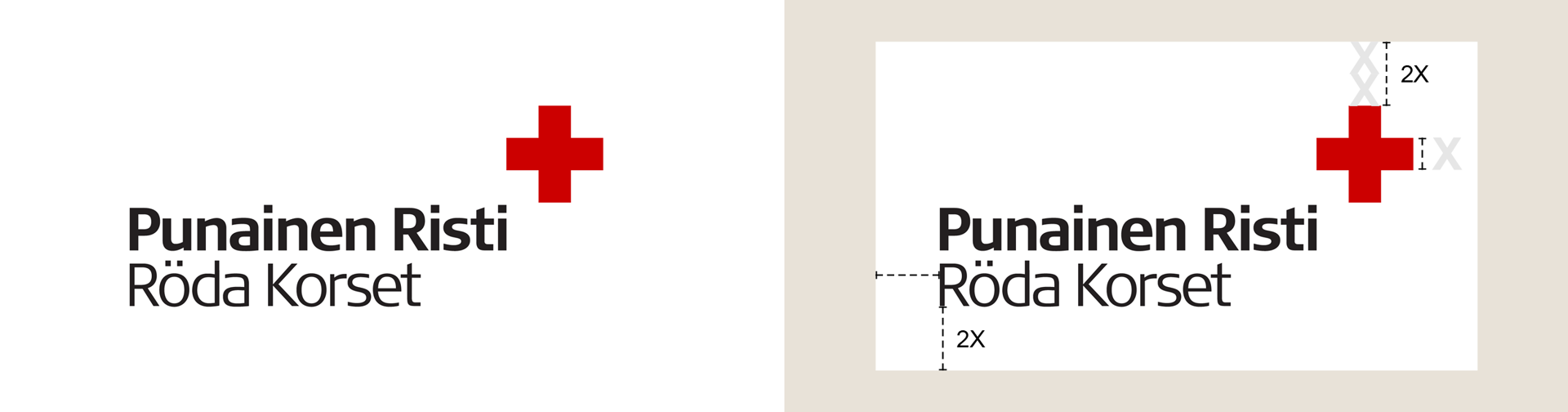
The logo must always appear on a white background that is at least as large as the specified protection area. The protection area is twice the width of the arm of the cross. No other elements may be placed inside the protection area. The logo must never appear without the white background.
The relationship between the red cross and the logotype must not be altered, and the protection area must not be encroached upon.
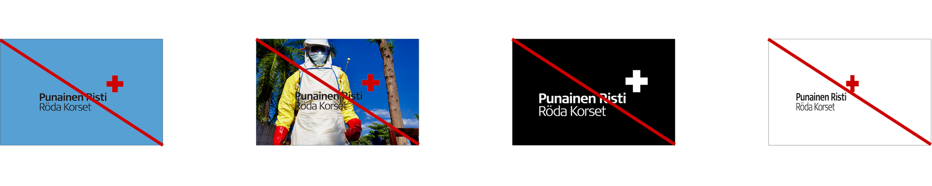
Prohibited uses
Always check that the proportions are correct.
Colours of the logo
The colours of the logo must not be altered. There is no white (negative) version of the logo. Select the correct colour version of the logo for the purpose to ensure that the tones are reproduced correctly. RGB colours and HEX colour codes are for digital use, while CMYK colours are for printed products. The colour specified for digital use takes into account the objectives set for accessibility.
Minimum size
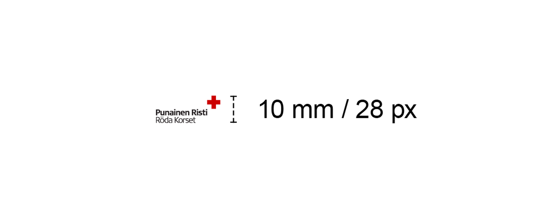
The logo must not be used in a smaller size than specified here.
Black and white
It is not recommended to use the logo in black-and-white printed products. In printable materials, the logo may be printed out using a black-and-white printer.
Language versions
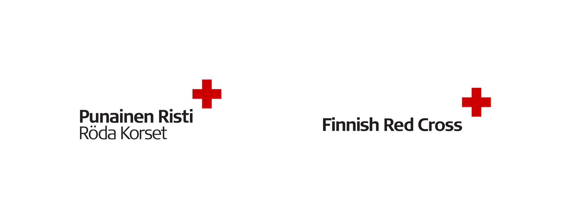
For the Finnish Red Cross logo, the bilingual version is primarily used, with the organisation’s name appearing in both Finnish and Swedish.
In the logos of institutions, districts, branches and other local activities of the organisation, the organisation’s name may also appear in only one language.
An English version of the logo also exists. For the sake of clarity, the organisation’s name appears in full in the English logo. The use of the English logo is subject to the same rules as the use of the bilingual version.
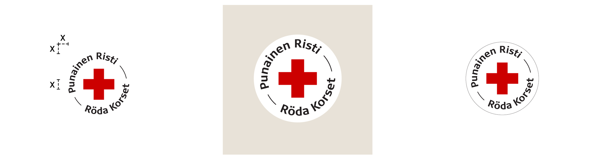
The organisation also has a circular logo, which is used on products, in business partnerships and in social media profile pictures at all levels of the organisation.
Branches and districts primarily use the logo of their own branch or district. This increases the visibility of local activities and directs any contacts to the right place.
Branches and districts may not produce logos by themselves or commission them from external suppliers. Only the Communications Services unit may produce logos for districts and branches. If necessary, please contact aineistot@redcross.fi. Logos have been produced for each district and branch, and these can be found in the Material Bank.
Use of the circular logo by districts and branches
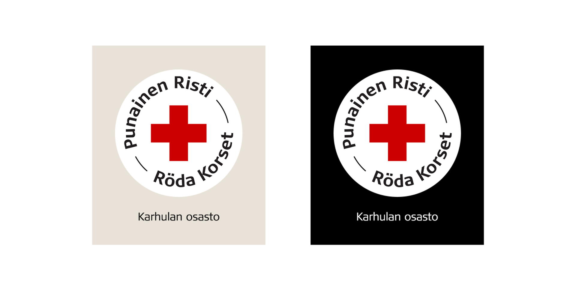
Branches, districts and institutions may use the circular logo on their products, such as T-shirts or tote bags. The name of the branch, district or institution must be placed under the circular logo as shown in the examples below. The text must be in black on a light background and in white on a dark background. The circular logo must always be used on a white background.
The circular logo can be used as a social media profile picture without the name of the district or branch.
The circular logo may not be used in printed products (brochures, publications, etc.) or printable products (annual reports, other reports, bulletins, etc.) or be made available for use by third parties.
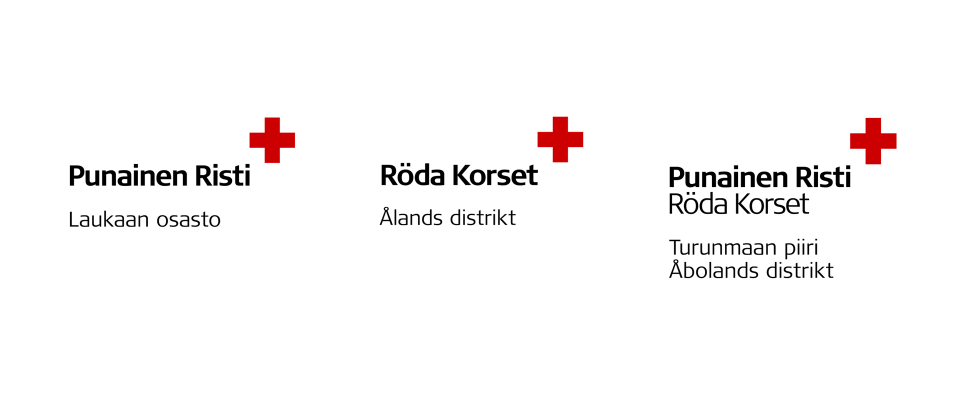
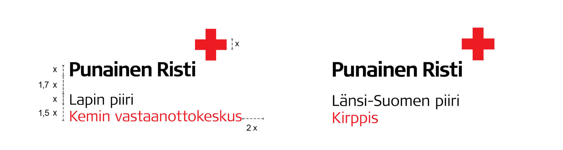
Regional operators, such as reception centres or flea markets, are added to the district logo. The nature of the activities is stated under the name of the district as shown in the examples below.
Logos for local activities are only produced by the Communications Services unit. Branches and districts may not produce logos by themselves or commission them from third parties. If necessary, please contact aineistot@redcross.fi. The ready-made logos for local activities are available in the Material Bank.
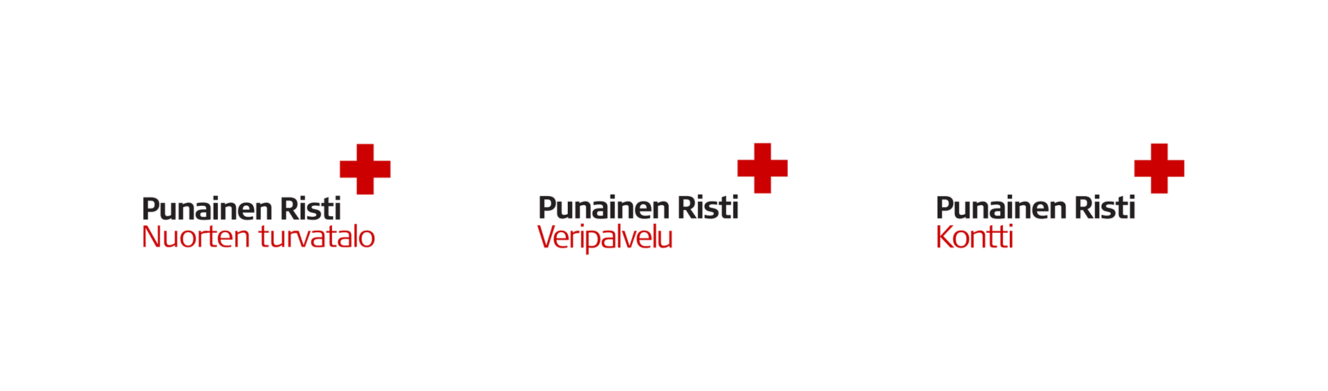
The Finnish Red Cross’s institutions, Blood Service, Kontti second-hand stores, and Youth Shelters each have their own logos, in which the name of the institution is placed under a monolingual version of the national logo.
There are also Swedish and English versions of the logos of the institutions. The subheading in another or multiple languages is added to the logo as shown in the examples below.
The ready-made logos are available in the Material Bank.
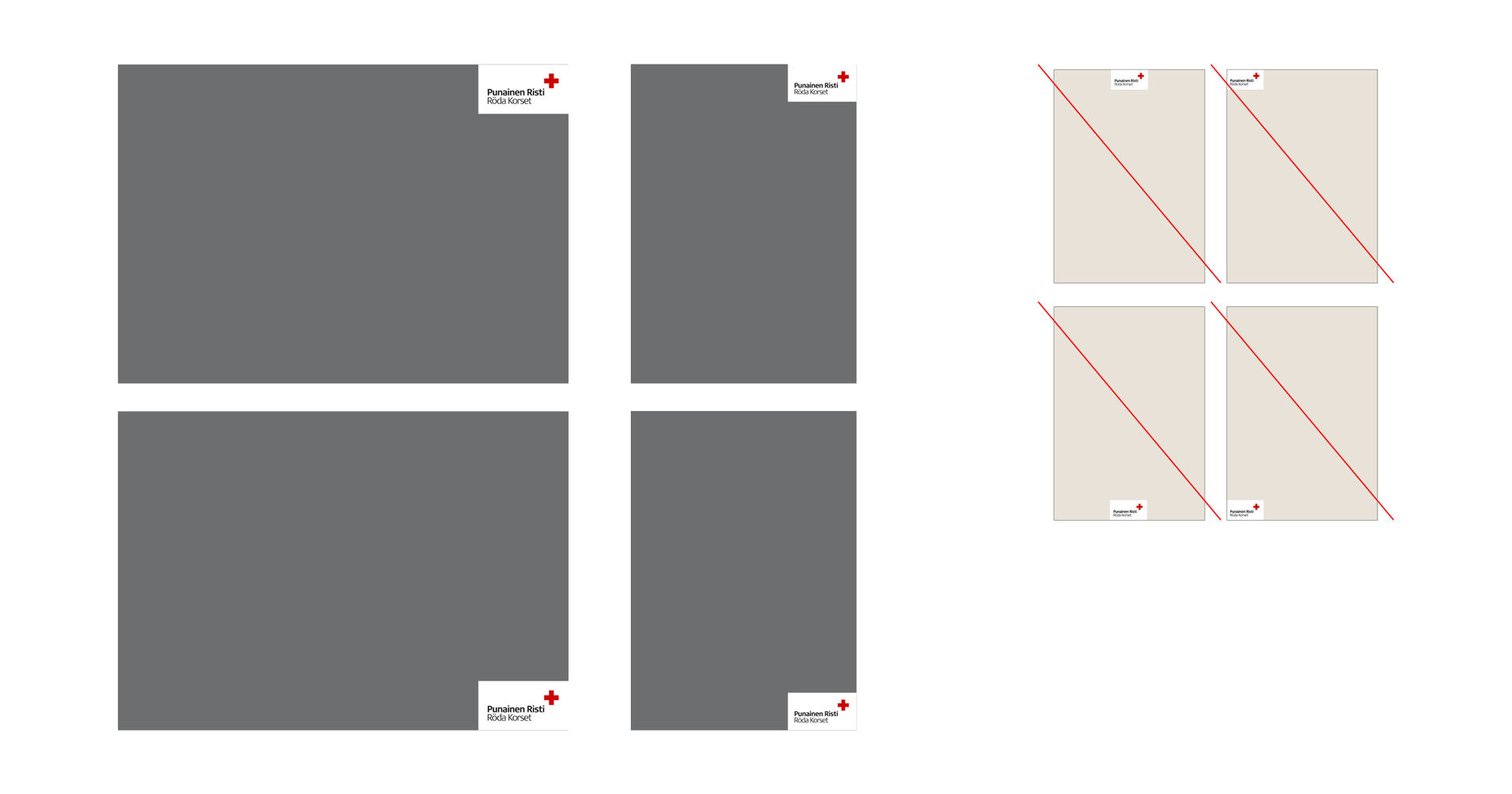
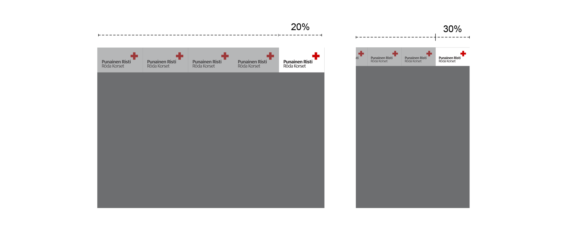
The size of the logo relative to the material being produced is set for the most part. The width of the logo is 20% of the total width in horizontal materials and 30% of the total width in vertical materials. In all materials, the size of the logo must be proportionate to the size of the final material.
The logo is always placed in the top right-hand or bottom right-hand corner, with two sides of the logo touching the sides of the material. The logo is already positioned correctly in all ready-made templates. Do not change the location or size of the logo in ready-made templates.
Size of the logo, including the exclusion zone
Horizontal A4: width 59.4 mm, height 27 mm
Vertical A4: width 63 mm, height 28.8 mm
Horizontal A5: width 42 mm, height 19.2 mm
Vertical A5: width 43.81 mm, height 20 mm
Please note!
In any material smaller than A6, such as business cards, and on large surfaces, such as large format prints and large digital displays, the logo is larger relative to the size of the material produced.
We make our national logo or another logo of the organisation available for our business partners to use in accordance with the cooperation agreement. The logo provided to our partners depends on the scope of the cooperation.
If the cooperation or partnership is with a district, branch or institution, the logo of that district, branch or institution will be used in all communications and marketing related to the cooperation. The national logo may only be used if the cooperation or partnership is nationwide and has been agreed on in writing with the organisation.
No Red Cross logo may be used without the organisation’s permission.
Please always seek approval for the use of the logos in your material by sending a draft or image to aineistot@redcross.fi.
The circular logo on products
Under a written cooperation agreement with the Finnish Red Cross, the organisation’s circular logo may be made available to the partner for use on products and in communications and marketing related to the cooperation. The logo may only be used as specified in the agreement. All material must be sent for approval to aineistot@redcross.fi.
The circular logo is always used with the white exclusion zone specified in the file. The version of the logo with a line around it is used only in a few instances.
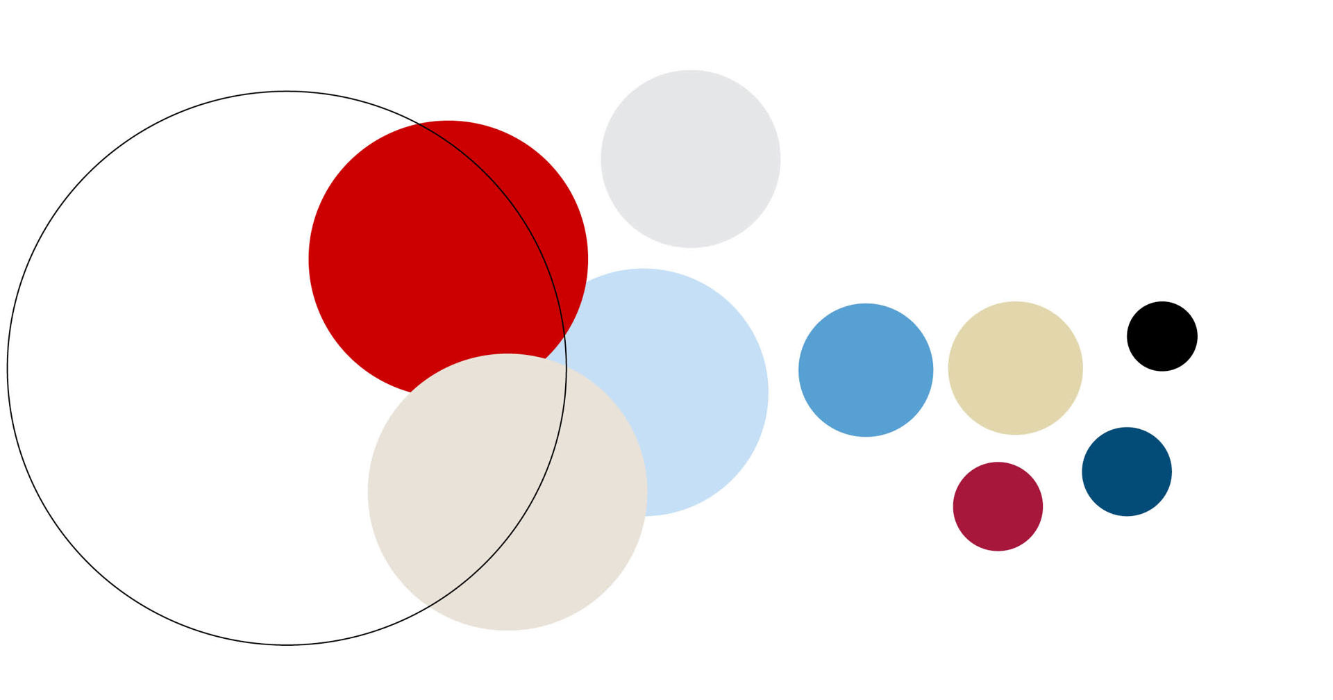
Together, the main colours, neutral colours and supporting colours facilitate distinctive yet versatile visuals.
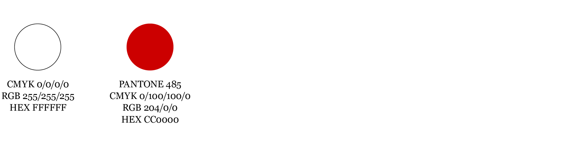
Main colours
The main colours are at the core of the Red Cross’s visual identity. They represent confidence, boldness and reliability.
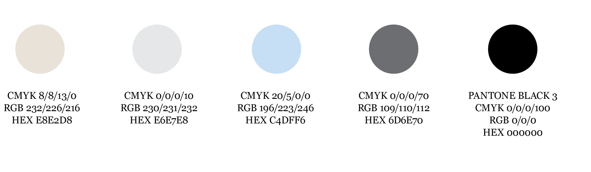
Neutrals
Neutral tones are warm and grounding.
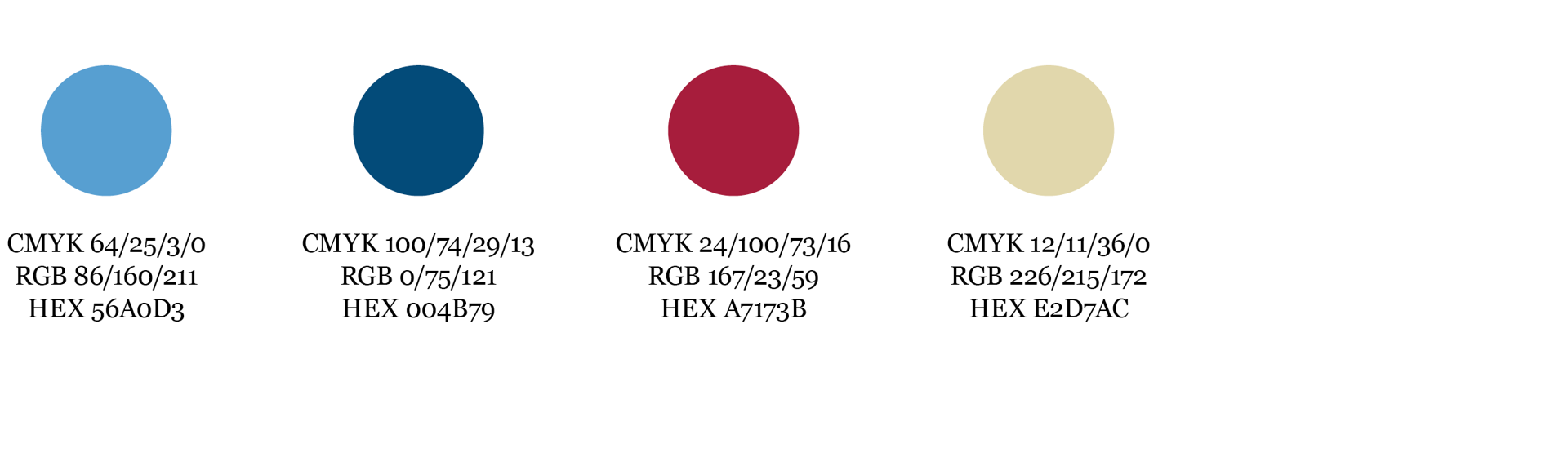
Supporting colours
Supporting colours make room for visual expression from strength to sensitivity.
Proportions
Instructions on how to use the colours in relation to each other.
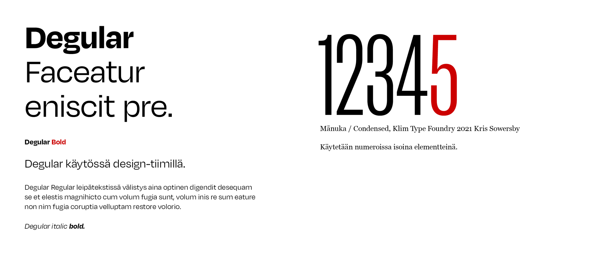
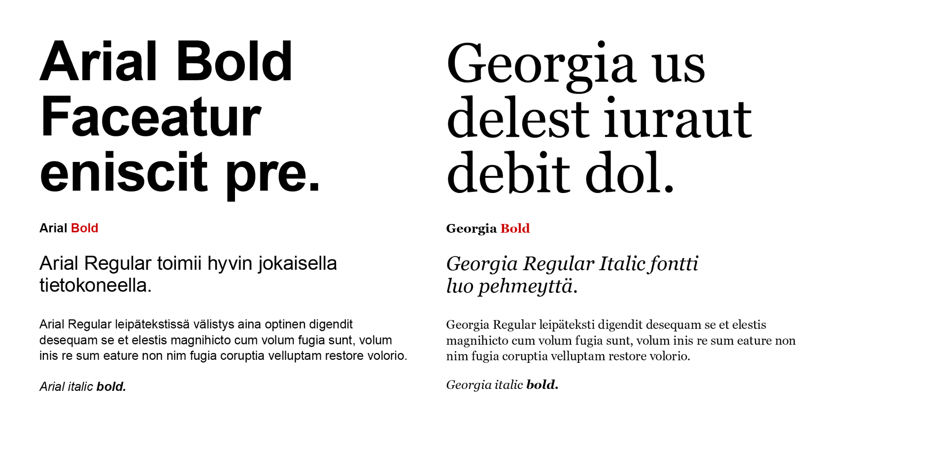
The primary font used by the Finnish Red Cross is Degular. It is installed in Canva and is used in the majority of materials. Arial and Georgia are available to everyone, and they are used in digital materials and Office programs such as Word and PowerPoint. The Finnish Red Cross brand team also uses the supporting font Mānuka, which is used exclusively for numbers.